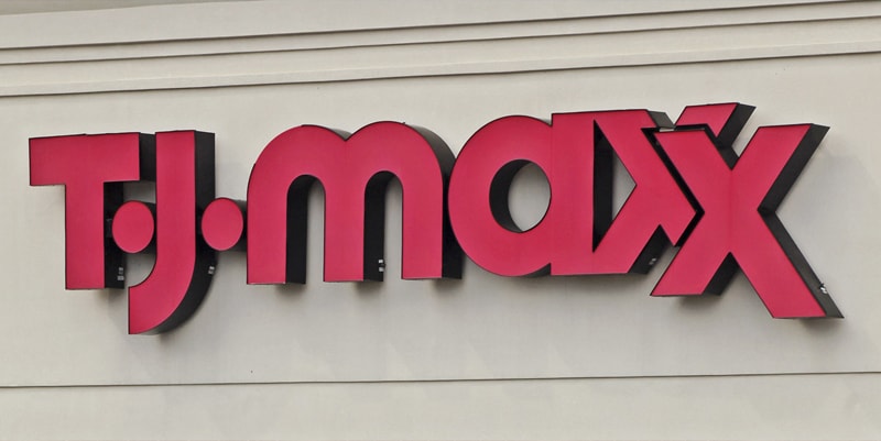
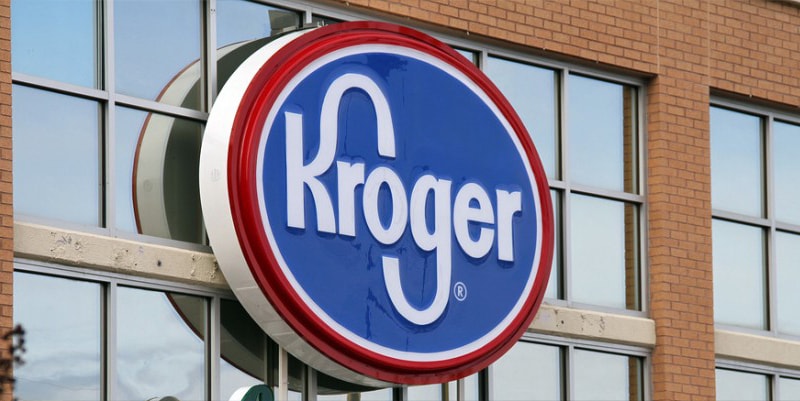
When designing signs for your business, it’s important that you take your time and choose your design elements carefully. Whether you’re identifying the name of your company, showcasing products and services, or promoting a current sale, the content and aesthetics of your signage will dramatically impact its effectiveness. Though graphic designers can certainly give your signage a more-creative, professional touch, successful business sign design is something you as a business owner can certainly accomplish on your own.
Color Is King
Color is what pulls a person’s gaze to a sign and the decision on what colors to include on a sign should be taken with extreme care. Once your business sign is made, whatever colors are present will become associated with your business, so picking the right color is critical.


Take a look at the pictures above of various signs; what immediately stands out to you? The color, right? Color increases brand recognition by up to 80 percent. (Source: University of Loyola, Maryland study)
Here are some insights into how color makes people feel:
Red – Red raises our breath and increases our blood pressure, so if you sell cars for example, a product that is related to speed, then red is what you may want to use for your building sign.
Blue – There is a relationship between the clear blue and the feeling of tranquillity. That is why you feel calm when you’re staring at the blue sky. So, if you sell mattresses, or you own a Spa or any other product or service related to relaxation then blue is the way to go. However, if you sell food, avoid this color, as it inhibits the appetite.
Purple – Purple was considered to be the royal color because it was rare to find it. So, if you sell suits or you have a real estate that lets luxury villas, then your clients will feel they are getting their money’s worth if you use this color on your business signage.
Deliver a Strong Message
The first impression your sign makes is extremely important, but the content displayed on your signs is even more crucial. When writing the content of your sign identify the main message you need to convey and make that the spotlight. This could be something simple like the name of your business or that you’re celebrating a Grand Opening, or it could be something more specific.
Don’t take sign content lightly—spend some time editing and revising your message so that it’s memorable and catchy. A good rule of thumb to remember when designing your side – less is really more. No one wants to spend more than a handful of seconds to read your sign, so the more you’re planning on including, the worse the sign will be in the end.
Images
Be careful when using images on your sign – the image should make an immediate connection to your business in the customer’s mind.
There are other considerations when using images. If you choose to use a photo, make sure that it is clear and large enough for the image to be easily discernible. Images can be used to replace information but can be too much when paired with a lot of text.
Your logo is often the best image to use on your sign. It makes the connection in the reader’s mind between your business and your message and builds brand consciousness at the same time.
